
Game Closet Redesign
Enhance the game's character closet experience with simplified navigation
My Role & Process
I led the following processes as a lead UX/UI designer. I collaborated closely with stakeholders, a product manager, and a technical game designer during the process.
Stakeholder Workshop
Competitor Research
Wireframing
User Flow
UI Design
Prototyping
Developer Hand-Off
Company / Product
Pixelberry Studios / Storyloom
Timeline
November 2022 - February 2023
Category
Mobile Application
Gaming
UX Design
UI Design
Project Overview


Before & after the redesign
Closet is an existing feature in game that allows players to customize their main character's outfits. Closet induces players to purchase premium items. By customizing character outfits, players engage better with characters and game contents.
However, the feature was outdated, so stakeholders requested my team to apply the new UI system and revisit the user flow so it could be reused to the new product, Storyloom.
Analysis
Existing closet was hard to navigate and lack of proper visual representation.
Problems

Through the stakeholder workshop and competitor research, I was able to find out improvement lists for the existing feature. All the user frictions and stakeholder requests are sorted out by the product priority. Below are further explanations of two main issues.
1. User needs: Simpler navigation is needed.
There are unnecessary steps that users have to tap through when there are multiple tiers of the menu or there are more items to display. Ideally, users should be able to see through all the menu structures on one screen so they can easily navigate.

2. Business needs: An intuitive item display is necessary to upsell premium items.
Compared with the competitor's case on the left, our game menu items are all displayed in text form so users cannot preview until selected. The premium vs. non-premium item indication was weak and it is hard to tell which items the user already owned. Improvement of the item preview should lead to an upsell of premium items.

Comparison of Novels (left) vs. Choices (right)
Design Solutions
Schematic design with two design options
Icon Scheme vs. Text Scheme
Two design solutions to simplify the user process in closet
I created two design schemes - an icon menu and a text menu scheme. While the icon menu has the potential to be intuitive to players, the text menu gets more positive feedback because it better supports specific categories of existing books. Both design schemes used thumbnails for the item previews.

Solutions to highlight character display view
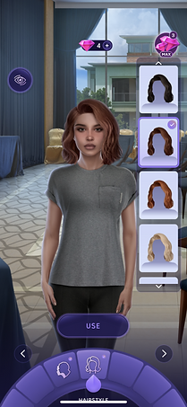
For a better highlight of outfits and accessories to players, I suggested hide/show UI mode. Furthermore, I proposed a dynamic character zoom mode depending on the closet items users choose, such as hair or full-body clothes. Both suggestions were implemented into the final design.


UI & Prototype
Final UI design focused on clarity & interactiveness
User Flow
Below shows the finalized user flow. You can see the enlarged when you click the image.

UI Design & Interactions
UI design breakdown
UI design matched the game UI guidelines that I set up previously. I considered following when implementing the design for the feature:
-
Are selected menu categories/items indicated clearly?
-
Is the premium item highlighted well enough to notice?
-
Can the format support different types of clothing/accessories?
-
Is the user interface easy to navigate?

Anatomy of Typical Closet Screen
Anatomy of Premium Menu
Thumbnail States
Thumbnail previews items so players can easily explore. I set up variations for the item thumbnails based on their states and the scale of the items.

Interactions

Overall Flow
First Time User Tutorial
Takeaways
Easier navigation leads to premium item upsell
We received positive user feedback with the final design prototype by user testing. Specifically, I was able to achieve the following compared to the old version of the design.
-
Save average 45 less seconds to navigate and find specific item
-
100% of users respond to prefer the new design over the existing design
-
Easier upsell of premium game assets by making the feature more accessible and indicating premium items upfront.
-
Users got excited when they saw the dynamic zoom in and out of the character, and mentioned that it feels engaging.