
Polywave
Design of the premium features for the music platform
My Role
I was a solo product designer
with the following responsibilities:
User Research Ideation
Competitive Analysis
Information Architecture
Wireframing
User Flow
Branding
Visual Design
High Fidelity Mockup
Prototyping
Usability Testing
Iterations
Product Category
Mobile Design
Multimedia
Music Player
Design Applications
Figma
Adobe Creative Suite
Timeline
1/2021 - 2/2021 (5 weeks)
Context & Business Goals

In this project scenario, I am working for a music startup company that has been successfully run a free product. The company’s business strategy was to first build a user base by offering a free experience and then evolve the feature set so they could monetize on a premium (paid) product. There were 3 business goals given to me as a requirement:
-
Design a premium experience that attracts users to subscribe and pay a monthly fee.
-
Design the signup flow for new users to subscribe to the premium product upon registration.
-
Introduce the premium to returning free users, while they are using the free version of the product.
Since this was a self-sourced project, I created a project plan that you can read from here.
Research
Users get exposed to the contents by the algorithm more than a direct search.
User Interview
I interviewed six users to identify their music listening habits and thoughts on the existing platforms (Spotify, Netflix, Youtube, and Pandora). Each interview took 30-minutes through the video call.
User type
-
Users aged 18-30
-
Heavy use of the web and mobile service (5+ hours per day)
-
Regularly visit at least two multimedia platforms (3 times a week)
Research goals
-
How users consume multimedia content?
-
What is the key complaint of the existing multimedia platform, both for free and paid service?
-
What makes users pay/not pay for the premium?
Synthesize
I created an affinity map to group user’s responses from the 6 interviews.
Below are 4 distinctive trends that I discovered from the mapping.
Click here to see the full affinity mapping
1. Users mostly play the music as a background while they are doing other tasks.
2. Users get influenced by their peer group when selecting the platforms and contents.
3. Users get exposed to the contents by the algorithm more than a direct search.
4. Users care about the quality of curation when choosing the music platform.

Affinity map using Miro
Persona
Based on the user interview, I created one user type. Joey is a casual listener, his motivation is to select the proper background music so he can focus on his tasks well.

Ideation
Finding solution to improve the algorithm and music suggestions.
Ideation
How might we improve the music queue and the algorithm so that users stay longer with the product?
Most of the users answered that YouTube's algorithm is too random, and Spotify's playlist is too safe. They also tend to rely on content that is recommended by the platform. So I decided to focus on improving the music queue and the algorithm that matches with the user's occasion, mood, and environment better.
Click to see the ideation process

Solution
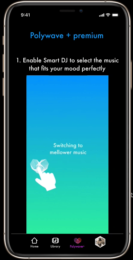
I came up with the solution that could substitute the skip button - while the skip button tells the platform only one thing (“play the next music”), I found mood-based feedback(“play the more energetic music”) will be effective to provide a better suggestion to the user. I decided to call the system ‘Smart DJ’, the main feature to be included in the premium.
The Smart DJ
Mood-based feedback(“play the more energetic music”) that substitutes the skip button ("play the next music")
Development of Smart DJ
I referred to Thayer’s mood model to define the mood of the music that users will navigate.

Source: Music mood classification, by Michael Nuzzolo
Image Source: Derived from Bhar (2014).
I developed low-fidelity screens of Smart DJ by hand sketch and Figma. I treated the white space on the music player as a space for Thayer’s music mood graph. When users drag the Polywave icon towards the desired location of the graph, the music will be changed to the mood that the user wants to switch.


Sketches for Smart DJ


Low-fidelity screens for Smart DJ
User Flows

User Flow 1 - Adding premium for new users
Low Fidelity
Smart DJ is accepted as a cool idea, but we need better instruction.
Wireframes

User Flow 1 - Adding premium for new users
Usability Test
I created low-fidelity prototypes with MVPs (minimum viable products). I tested out the prototype to five users, spent 30 minutes per user by video call.
Below are a few insights I got from the low-fidelity usability test and showing how I iterated on the next stage.
1. Users responded to the premium trial better when they are the new user versus when they are already on the free version of the product.
Users feel like it is not that much of an incentive to try the premium if they are already using the app without any problem.
Solution:
-
I added video instructions to explain the premium features better to the users, to make them more convincing.
-
I noticed users respond better with getting rid of penalties (such as ads-free policy for Spotify premium) - so I showed what is not possible for the free version, such as premium content with the lock icon occasionally.

Low fidelity prototype
High fidelity prototype
2. Smart DJ is accepted as a cool idea, but we need better instruction.
Users made 4 mistakes on average until they comfortably switched the music with Smart DJ. I added a small question mark icon to help users to remind which direction to go. However, none of the users associate the icon with showing the guide of the Smart DJ.
Solution:

Smart DJ instruction in low fidelity
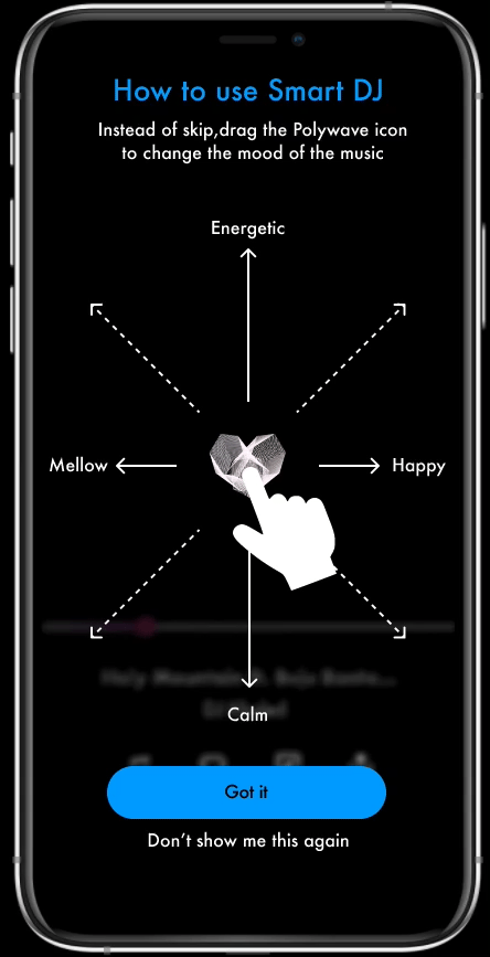
Animated instruction in high fidelity

Activating the guide in low fidelity
Activating the guide in high fidelity
3. The lock screen is inconsistent with the app.
Solution:
-
Updated the lock screen with consistent visuals and interaction with the app.

Lock screen in low fidelity

Lock Screen in high fidelity
4. Polywave+ tab: “It does look cool, but I am not sure what they are doing”
Polywave+ tab has contents arranged by the moods, based on the algorithm that the user’s been teaching the product. However, many users got confused about the graph display. After the test, I realized the graph recommendation is not a part of MVP so I decided to simplify the function and the display.
Solution:
-
I updated the screen to look similar to the home screen, however showing only exclusive contents.


Polywave+ in low fidelity
Polywave+ in high fidelity
High Fidelity
Overall user interaction with Smart DJ got better with improved instructions.
High Fidelity Prototypes
I developed the high-fidelity prototype reflecting the findings from the previous usability test. You can test out clickable prototypes using the links below.
Flow 1: onboarding for new user
Flow 2: introducing the premium to the existing user
I conduct another round of usability tests with the high fidelity prototypes, with five users through the video call.
Test Findings & Iterations
Below are what I found from the high fidelity usability test.
1. Overall user interaction with Smart DJ got better with improved instruction.
With animated instruction and an easy way to activate/deactivate the guidelines, most of the users interacted with Smart DJ without making a significant error. Two users made minor mistakes in the beginning. But after 1-2 trials, they operated the Smart DJ smoothly. Users commented the Smart DJ system is intuitive and user-friendly, especially after a few tries.
Smart DJ interaction
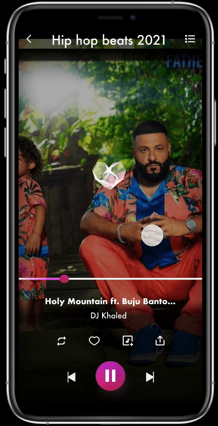
2. The Smart DJ takes too much space on the lock screen.
Two users mentioned that they don’t prefer the music app taking too much space on their lock screen. They rather want to save space for important texts or emails.
Solution:
-
I agree that the music app should not distract the user's productivity. So I dropped the Smart DJ function from the lock screen.

3. The sign-up for the premium rate went up by 33% for the existing user scenario.
I saw the following helped the improvements;
-
All the users noticed the lock icon on a certain menu. Showing the lock icons with the premium contents visually reminded the users of the barrier in the current free plan.
-
Polywave+ bottom navigation menu has a consolidated marketing screen - all the visual materials and animation helped users to understand the premium features.
Showing the locked contents for the existing (free) user flow
4. Users liked the shareability of the premium account. However, they don’t need to switch between accounts once they logged in.


5. The favorite icon vs. thumbs up & down icons
The favorite (heart) icon has added to receive user feedback about the music, to provide a decent music recommendation to the user as a result. However, many users think thumbs up & down icons are more efficient for the purpose.


'Netflix' style profile management
Separate log-in between the share users
Branding & Visual Design

Conclusion
What makes users sign up for the premium service?
I had a great opportunity to think about the product’s business goal - make users sign up for the premium (paid) service. Below are few findings through this project:
-
Users liked the free trial of the premium so they can try the product without the risk.
-
Users agreed to try the premium more often when they are the new user versus they are the existing user of the free service.
-
In the case of the existing user, showing the barriers of the free version helped them sign up for the premium.
Next steps
The algorithm and user feedback are critical for a successful music product but it isn’t easy to prove the performance within a short period of time. So if I get a chance, I would like to keep test and collect the data of how the Smart DJ gathers user feedback and reflect that to the algorithm.
I spent quite a time testing the interactions for this particular product because Smart DJ is all about finding the fine-tune of user’s needs when listening to the music. Overall, I got great feedback from the users about this product being intuitive and easy to follow. So I would say that I am at a great starting point. If I develop further on this product, I would carry the interaction design in broader terms, such as device vibration and voice recognition.